The earliest biomarkers, such a body temperature or blood pressure, were single measurements that reflected multiple physiological processes. Today, though, our reductionist approach to biology has turned up the resolution of our lens: we can measure levels of individual proteins, metabolites and nucleic acid species, opening the biomarker floodgates.
But this increased resolution has not necessarily translated into increased power to predict. The principal use of biomarkers after all is to use things that are easy to measure to predict more complex biological phenomena. Unfortunately, the levels of most individual molecular species are, on their own, a poor proxy for physiological processes that involve dozens or even hundreds of component pathways.
The solution is to combine individual markers into more powerful signatures. Biomarkers like body temperature allow physiology to perform the integration step. But for individual molecular biomarkers that job falls to the scientist.
Unsurprisingly, the success of such efforts is patchy – simply because there are an infinite number of ways to combine individual molecular biomarkers into composite scores. How do you choose between linear and non-linear combinations, magnitude of coefficients and even at the simplest level which biomarkers to include in the composite score in the first place?
The first port of call is usually empiricism. Some form of prior knowledge is used to select an optimal combination. For example, I may believe that a couple of biomarkers are more likely to contribute than others and so I may give them a stronger weighting in my composite score. But with an infinite array of possible combinations it is hard to believe that this approach is going to come anywhere close to the optimum combination.
Unless you have a predictive dataset, however, this kind of ‘stab in the dark’ combination is the best you can do. Just don’t be surprised if the resulting composite score is worse than any of the individual biomarkers that compose it.
With a dataset that combines measurements of each individual biomarker and the outcome being modeled, more sophisticated integration strategies become possible. The most obvious is to test each individual marker in turn for its association with the outcome and then combine those markers that show a statistically significant association. Perhaps you might even increase the weighting of the ones that are most strongly associated.
But how powerful are these ad hoc marker composites?
From a theoretical perspective, one might imagine the answer is not very powerful at all. While common sense suggests that each time you add another marker with some new information in it the predictive power of the composite should improve, unfortunately this simple view is too, well, simple. Each new marker added into a composite score contributes new information (signal) but also further random variation (noise). To make a positive contribution, the additional signal has to be worth more than the additional noise.
Even when the data is available, asking whether each marker is significantly associated with outcome to be predicted is therefore only looking at one half of the equation: the signal. It does little to quantify the noise. Worse still, it doesn’t address whether the signal is “new” information. Too often, the individual markers used to construct a composite are correlated with each other, so the value of each new marker is progressively reduced.
In sharp contrast, the random noise from different markers is rarely, if ever, correlated. So each added marker contributes a full shot of noise, but a heavily diluted dose of signal. Making biomarker composites more powerful than the best single marker is therefore no trivial exercise.
Here is a real-world example from Total Scientific’s own research that nicely illustrates the problem. Angiography is widely used to visualize the coronary arteries of individuals suspected of having coronary heart disease. The idea is to identify those at high risk of a heart attack and to guide interventions such as balloon angioplasty, stenting and bypass grafting. In this respect, the angiogram represents a perfect example of a biomarker composite. Measures of stenosis in all the major coronary artery regions are to be used to predict a clinical outcome (future heart attack).
At the top level it works well. Treating the angiogram as a single marker yields useful prediction of future outcome. Those with coronary artery disease are (unsurprisingly) at much higher risk of heart attack (Figure 1).
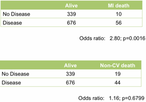
Figure 1. Association between the presence of disease detected by angiography and death following a myocardial infarction (upper table) or death unrelated to cardiovascular disease (lower table). All data from the MaGiCAD cohort with median follow-up of 4.2 years.
As a useful control, the presence of coronary artery disease is not associated with death from non-cardiovascular causes. Perhaps the most striking thing about this data, though, is the size of the effect. People with a significant coronary artery stenosis are only at 3-fold excess of risk of dying from a heart attack in the following four years compared to those with no significant disease by angiography.
Is there more data in the angiogram? For example, does the total amount of disease or even the location of the lesions provide better prediction of who will go on to suffer a fatal heart attack? To address this question, we need to treat the angiogram as a collection of separate markers – a measurement of stenosis in each individual coronary artery region.
Among those with some disease, the total amount of atherosclerotic plaque does have some further predictive value (Figure 2). But again, the most striking observation is the weak nature of the association. Having a lot of disease versus a little puts you at only marginally greater risk of the fatal heart attack – the total amount of disease cannot be used as a guide as to where intervention is clinically justified.
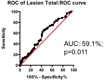
Figure 2. Receiver-Operator Characteristic (ROC) curve using total lesion score to predict death as a result of a myocardial infarction (in the “diseased’ group only). Total lesion volume is better than chance (which would have an AUC of 50%; p=0.011) but carries very little predictive power (a perfect test would have AUC = 100%, and each increment in AUC is exponentially more difficult to achieve).
If the total amount of disease has so little predictive power, does the location of the disease provide a more clinically useful guide? Previous researchers have attempted to incorporate the location of the lesions into a biomarker composite score. One example is the Jeopardy Score that assigns weights to disease in different regions of the arterial tree according the proportion of myocardial perfusion that would be lost due to a blockage in that region. Plaques in proximal locations that cause a greater perfusion deficit ought, in principle, to be more dangerous than stenosis in more distal regions.
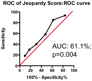
Figure 3. ROC curve using Jeopardy Score to predict death as a result of a myocardial infarction.
Testing this biomarker composite, though, yields disappointing results (Figure 3). The composite is no better than a simple sum of all the lesions present (compare Figure 2 and Figure 3). More lesions (wherever they are located) will tend to increase Jeopardy Score, so its unsurprising that Jeopardy Score performs at least as well as the total extent of the disease. But it is clear that the additional information about the perceived risk of lesions in different portions of the vascular had no further predictive value.
Does this mean that future risk of fatal heart attack is independent of where the lesions are located? Not necessarily. The Jeopardy Score biomarker composite was assembled based on a theoretical assessment of risk associated with proximal lesions. But are proximal lesions really more risky?
Yes and no. Using the MaGiCAD dataset, we have constructed ‘heat maps’ showing where lesions were most likely to be located among the individuals who died from a heart attack during follow-up, compared with those who did not (Figure 4). As expected, the left main stem (which feeds both the left anterior descending artery and the circumflex artery) was the site of the most dangerous plaques. But the next most dangerous location was the distal portion of the circumflex and left anterior descending arteries.
Using this information create a revised Jeopardy Score based on the observed risk in the MaGiCAD dataset now yields a model that significantly improves on the published Jeopardy Score based on theoretical approximation (Figure 4; right panel). This suggests there really is useful information encoded in the position of the lesions within the arterial tree.
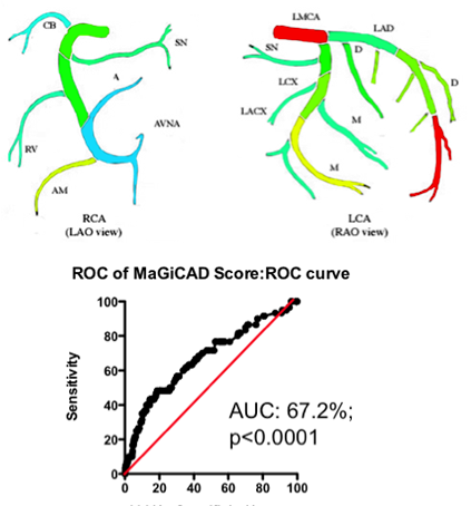
Figure 4. Left Panel: Heat map of the coronary artery tree showing the relative lesion volume among individuals who died following an MI during follow-up compared to those alive at the end of follow-up. Dark red represents a 3-fold excess lesion volume among the cases; dark blue represents a 3-fold excess lesion volume among the controls. Note that the highest risk lesions are located in the left main stem (LMCA), with risk graded from distal to proximal in the left anterior descending (LAD) and circumflex (LCX) arteries, while risk is graded from proximal to distal in the right coronary artery (RCA). Right Panel: ROC curve using the weightings from the heat map (left panel) to predict death as a result of a myocardial infarction.
Is this the best predictive model you can generate? Almost certainly not – it turns out that the location of the most dangerous lesions depends on other factors too. The left main stem is dangerous in younger men (justifying its colloquial designation as the ‘widowmaker’) – but in men over the age of 65 and in women lesions in the left men stem are no more dangerous than those elsewhere in the arterial tree.
Mathematical tools exist to create optimized models combining all these different factors. One example is the Projection to Latent Structures (or PLS) implemented using SIMCA. Constructing a PLS model from the MaGiCAD data yields a yet more predictive model (Figure 5; right panel). Figure 5 illustrates the gradual improvement in the performance of the biomarker composite as more sophisticated algorithms are used to weight the component markers.
All this nicely illustrates how data-driven optimization of biomarker composites can dramatically improve predictive power. But it does not (yet) give us clinically useful insight. Because the models have been derived using the MaGiCAD dataset, the ability to predict outcomes in the MaGiCAD cohort (so-called ‘internal predictions’) is likely to be artificially high. This is particularly true of the PLS model, because PLS is a ‘supervised’ modeling tool (in other words, the algorithm knows the answer it is trying to predict). Before we can start to use such a biomarker composite clinically, we need to test its ‘generalizability’ – how good it is at predicting death no matter where the angiogram was performed.
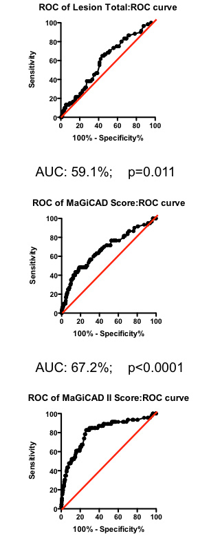
Figure 5. Series of ROC curves demonstrating the improvement in predictive performance with more advanced algorithms for weighting the component markers derived from the angiogram. Right Panel: ROC curve using the weightings from the PLS model of the MaGiCAD angiography dataset to predict death following a myocardial infarction.
Why might the model not be generalizable? One obvious reason is that the outcome (death following myocardial infarction) may have been modulated by the intervention of the clinicians who performed the angiography – using the information in the angiogram itself. It is perfectly possible that distal lesions appear to be the most risky precisely because clinicians perceive proximal lesions to carry the most risk and so treat proximal lesions more aggressively than distal ones. If that were true, all our heat map would represent is the profile of intervention across the coronary artery tree rather than anything about the underlying biology. Since patterns of interventions may vary between clinical teams, our highly predictive biomarker composite may apply uniquely to the hospital where the MaGiCAD cohort was recruited.
If this example does not provide all the answers, it should at least provide a list of questions you should ask before adopting published biomarker composites. Just because a particular composite score has been used in many studies previously you should not assume it represents an optimal (or even a good) combinatorial algorithm. Usually, combinations are assembled on theoretical (or even ad hoc) grounds and rarely are different combinations considered and compared.
Nor should you assume that combination of component markers will automatically be more powerful than any of the individual markers. Because the noise in different markers is rarely correlated, but the signal component is more often than not highly correlated, the act of combination inherently reduces power, unless it has been done very carefully.
Before adopting a biomarker composite as an end-point in a clinical trial, you need to understand which components are contributing the greatest noise and which contain the dominant signal. The results of such an analysis may surprise you.
But most importantly of all, you should recognize that the superficially straight-forward task of combining individual biomarkers is not a task for the uninitiated. Injudicious combination will reduce rather than increase your power, and even with the most powerful statistical tools available today developing superior biomarker composites is a slow and painstaking task, with no certainty that the composite score that emerges will be much superior to its components. In short, biomarker composites are more likely to be your problem than your solution.
David Grainger
CBO, Total Scientific Ltd.
Read the original article here
RxCelerate Ltd is an outsourced drug development platform based near Cambridge, UK. We specialize in delivering an entire road map of drug development services from discovery and medicinal chemistry through to formal preclinical development and clinical up to Phase IIa. In the last five years, we have witnessed dramatic changes in the drug development …